Footers in web design are underrated.
Not slightly underrated. Massively, consistently, almost universally underrated.
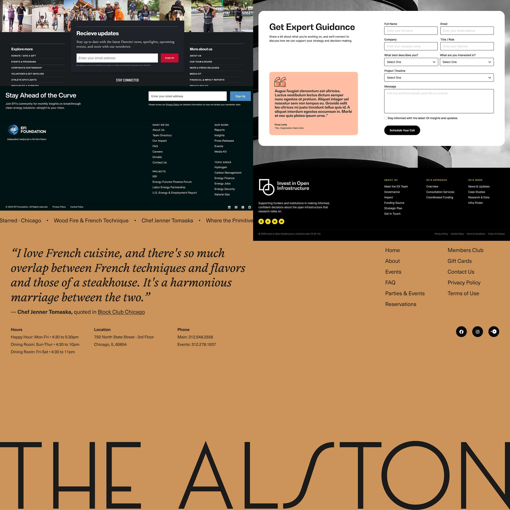
Open almost any website and scroll to the bottom. What do you find? A few columns of links, a copyright line dated two years ago, maybe a row of social icons that still links to a Twitter account that’s since been rebranded, repurposed, or quietly abandoned. Sometimes a privacy policy. Sometimes a language selector no one’s ever used.
That’s the default. That’s what footers look like when nobody has really thought about them.
And most of the time, nobody has.
Dead Space, or Prime Real Estate?
Here’s the thing about footers: they come at the end. Obvious, yes but think about what that means contextually.
By the time someone reaches your footer, they’ve made a decision. They read something. They scrolled. They stayed. That’s not passive behavior. That’s engagement. A person at the bottom of your page is not the same person who landed at the top of it. They’ve been on a journey, however brief, and your footer is literally the last impression you leave them with.
That’s not dead space. That’s prime real estate.
And yet most brands treat it like a legal disclaimer dumping ground. A place for the stuff that has to be somewhere but doesn’t belong anywhere else. Terms of service. Cookie preferences. Registered company address. Accessibility statement. Fine. Those things need to live somewhere. But they don’t need to be all the footer is.
The footer is the final note of the song. You wouldn’t spend three minutes building atmosphere and tension and then just stop mid-bar and walk offstage. So why do we do that with websites?
Constraints Are Where Design Gets Creative
There’s an argument to be made that footers are one of the more interesting design challenges on any given site — precisely because of the constraints they come with.
Fixed position in the hierarchy. Secondary status relative to everything above it. Often the smallest type on the page. A zone that users have been trained, by decades of web convention, to treat as functional rather than experiential.
But constraints are where design gets creative. Always have been.
The brief “make a footer” is actually asking something harder: how do you create something that feels intentional and considered in a space that everyone expects to be ignored? How do you close the loop on a brand experience in a format that’s roughly 80% sitemap?
That’s a real design problem.
What a Footer Can Actually Do
Let’s be concrete about the opportunity here.
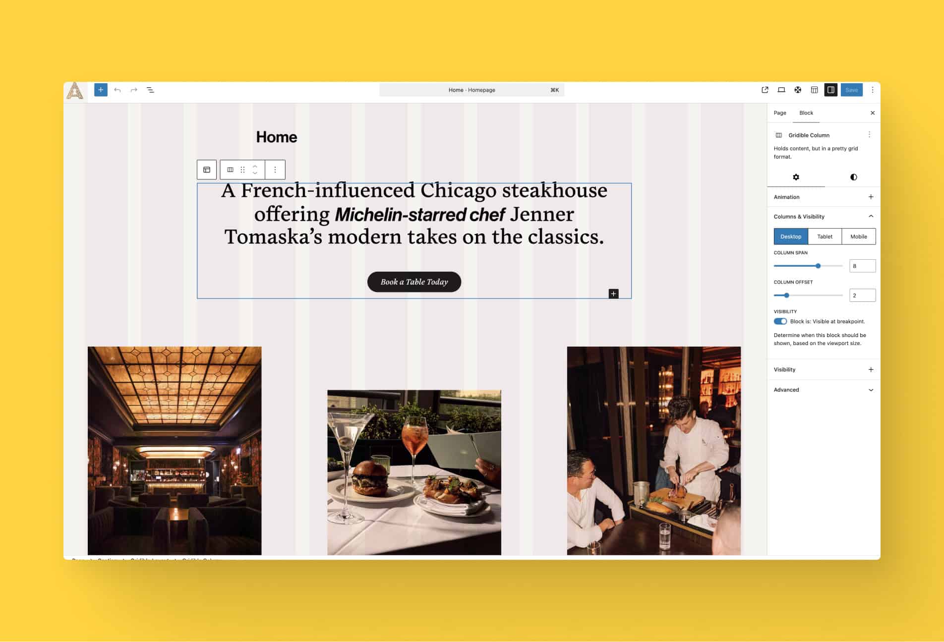
A footer can reinforce your brand voice. If your entire site speaks in a certain register — warm, direct, funny, authoritative, irreverent — and then the footer drops into legalese and bureaucratic link-lists, there’s a tonal whiplash that people feel even if they don’t consciously register it. Conversely, a footer that keeps the voice alive all the way to the last line feels coherent. Trustworthy. Like someone thought about the whole thing.
A footer can create a moment of delight. Not manufactured, not forced. Just a small thing that earns a smile. A clever line. A piece of illustration that’s a little more playful than the rest of the site. An Easter egg that rewards people who actually scroll to the bottom. These moments are memorable precisely because they’re unexpected in this space.
A footer can drive real action. Newsletter signups in footers convert surprisingly well. The people who’ve made it to the bottom are pre-qualified. So does a well-placed CTA, a “back to top” interaction with a little character to it, or even just a line that reframes the next step warmly rather than mechanically.
A footer can feel like a second homepage. Some of the most impressive site footers essentially function as a distilled version of everything above — brand promise, key links, contact info, personality — packaged in a way that someone dropping in cold could almost orient themselves from. That’s ambitious, and it doesn’t always make sense, but when it works it’s genuinely impressive.
Footers We Still Think About
There’s a small canon of footers that have done something genuinely interesting with the format.
Editorial illustrations that feel like a hidden feature. Mini manifestos. Two or three sentences that somehow say more about a brand than the entire homepage hero. Unexpected humor tucked into the copyright line. Newsletter moments that don’t feel like a data grab. Footers with illustration so good you screenshot them.
The thing these share isn’t budget. Some of them are dead simple to execute. What they share is intention. Someone made a decision about what the footer should do and then did that thing on purpose.
That decision is available to every team, regardless of how complex the site is or how limited the resources are.
Small Things Compound
None of this is to say that a bad footer is a crisis. It isn’t. Most people don’t consciously notice footers. Most people don’t consciously notice a lot of the things that shape their impression of a brand.
That’s kind of the point.
The impressions that stick are often made up of a dozen small things that individually wouldn’t move the needle but together, accumulated, they add up to something. The feeling that a brand is considered. That someone cares about details. That the experience has been designed, not just assembled.
If your footer says nothing about who you are, that’s a missed opportunity. A small one, maybe. But small things compound.
You’ve already done the hard part you built the rest of the site. The footer is the last hundred meters. It costs relatively little to run them well.
What does your footer say about you? Scroll to the bottom of your own site and look at it with fresh eyes. If it could be copy-pasted onto any other site in your industry without anyone noticing, it might be time to give it a second thought.