
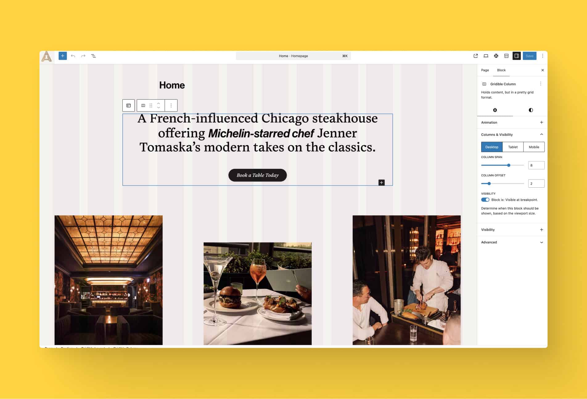
WordPress now lets you apply styles to blocks based on device size and interactive state. From the block settings panel, you can define distinct styles for mobile, tablet, and desktop breakpoints, as well as pseudo-states like hover, focus, and active for blocks that support them.
This means a button can have a different background color on hover, a card group can reflow its layout on mobile, and a heading can shrink its font size on smaller screens, all configured visually in the editor without touching a stylesheet.
The controls live in the block’s Style panel in the sidebar. A new state selector lets you choose which context you’re designing for: default, hover, focus, or active. A viewport toggle lets you switch between breakpoints and adjust spacing, typography, color, and other supported properties independently for each. Styles defined for one state or size don’t affect the others.
The feature works on individual blocks as well as Group blocks, making it practical to coordinate the look of an entire section across breakpoints or define a hover treatment for a whole card at once.
It’s a significant step toward building fully responsive, interactively polished pages without leaving the editor and drastically reducing the need for custom code in your theme.